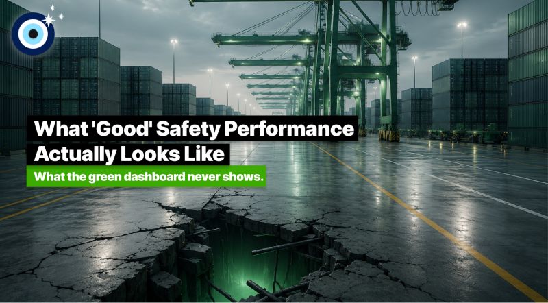
A green dashboard. A low TRIR. An incident count that's flat or trending down. The leader presents. The room nods. Everyone moves on.
Let me ask the hard question - is what we're measuring really what ‘good’ looks like?
In my 20+ years in and around container terminals, I have watched this ritual play out in countless reviews. My quiet but steady hunch - a green dashboard usually says more about reporting than it does about safety.
What I believe ‘good’ actually looks like is harder to capture in a single slide:
• Workers reporting near-misses every week, because the system actually rewards it
• Investigations that close in days, not months
• Stop-work events that aren't punished
• A leadership team asking about leading indicators before lagging ones
• Frontline data reaching the boardroom unfiltered
None of that fits neatly on one dashboard. But it is, in my experience, what separates terminals that are genuinely safer from terminals that just look safer.
I suppose the part that is hard for many to sit with is this. You can engineer a perfect lagging dashboard while the underlying culture is quietly rotting. We've seen it. Some of us have lived through what comes next.
This is the gap we set out to close with Qavach. The platform is built to surface the things that don't show up in traditional safety reports. Behavioural data, participation data, time-to-action data. So that ‘good’ can be measured by what people are actually doing, not just by what didn't blow up.
If you removed your TRIR from your safety review next month, what would you measure instead?